Starting a business by creating a website or any other kind on the Internet, comes with dedication, patience, and a little bit of knowledge. eCommerce seems to be the biggest online service. Including all the niches you can go through; eCommerce websites are truly a lot.
However, if you decided to take that road, eCommerce web design is probably one of the main important things you need to consider. This is why after sharing with you the most neglected eCommerce tips, I am now presenting you with 6 eCommerce web design tips.
Overlook and Buttons
After you choose your website hosting, you figure out your name, plan the products to sell, and set your goals, it’s time to create your eCommerce web design.
This particularly is a personal decision and you can choose th e way it will look (by that I mean colors, sections, etc.) But what matters is how easy it will be and look for the customers.
You may be attracted to more complicated and interesting looks, but when someone comes to your website and wants to buy a thing or two, they want to find it easy and then check out from it easy.
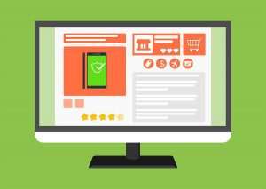
One way to do that is by including a lot of buttons – call to action and informative. They need to be simple, clear, stimulating action, and making your customers’ life on the website easier.
The more simple, beautiful, and in order, your website looks, the better it will be for everyone. So, with that said, there is one specifically important button you absolutely need to give thought to.
Shopping Cart
It’s the most obvious button, but you can’t neglect it. As you probably have seen, most websites put their cart in the right upper corner. If you want to do that, perfect. Don’t overthink it, it doesn’t have to be original, just obvious. And if you don’t like it there, just put it somewhere where it will be always in front of your customer’s eyes.
Pricing
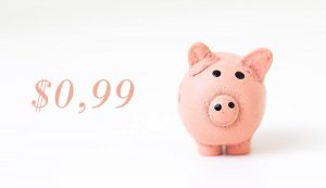
The next most important step is the pricing you put on the items you are selling. Honestly, when it comes to shopping no matter if it’s online or live, most of the owners prefer to use a mind-tricking method. And by that, I mean the $0.99 pricing. Everybody knows it’s just a dollar, but when you see the 0.99, your mind automatically prefers it. It thinks it’s better, cheaper, and more convenient for you.

That’s a good technique you can use. But the most important you should know when you choose prizes for your items is that you need to put honesty on a pedestal. Don’t put one prize on the first page and then add extra fees about random things in the shopping cart.
Be present with the shipping too. Put the shipping button in an obvious place too. Then be honest about it. Say what are the ways people can receive their orders and at what time.
When it comes to eCommerce web design you must prioritize the buttons that are most obvious and find a place for all of them. And in that time still, let it look simple and easy to use. It’s like dancing in sync.
Content
I always have favorites – I can’t help it. This one is the one. And in content, I don’t just mean the eCommerce web design with the text around the products, but photos too.
And let’s start with them – Photographs. To be fair, it would be best if you can take professional photos of your items by yourself. For example, find a model or if it’s a retail, just take pictures in a studio or in a good photographic place.
But if you can’t do that, make sure the photos you are using are good enough – good quality and preferably bright. Photos that bring light and are sunnier attract more.
If your website is looking stylish though, you can combine it the way you think is best. You can also use stock photos downloaded online. Here is how to find images online.
When you are done with the photographs, take the time to describe your products. For eCommerce web design it is really important to mix the description with the item in a way that it will be interesting, attractive, and honest again.
It all depends on what your eCommerce store is about. But still, try telling a story with your products. When people feel close to the components they are more willing to make a purchase. But don’t share too much text. Not all clients want to read, some of them are in just to shop.
For example, if you are providing web hosting, you can share a personal story of someone who created a beautiful work with their website in your blog. If you are selling kitchen supplies, show what people can cook in them after that. Try getting closer to your customers.
Think about what they need and present what you can give them to help their needs. And if you are good you’ll do it without them even needing it. But that’s the next level in eCommerce web design and characteristics.
In content, we can also include the reviews. Sometimes people are not confident about an item, they might even feel insecure. You need to have up in your sleeve an affirmation. And reviews of people who already used an item are one way to do it. Some even show how many orders a product has, or photos from customers (if it’s about clothes, shoes, bags, etc.) Here is how to find reviews online.
Details
There are a few more really important things about eCommerce web design that I have to share. I assume most entrepreneurs do their research before starting something like eCommerce and they have an idea of how to structure their website. But still, I can’t miss the search bar and the filters.
As I mentioned, simplifying your website is significant to having a successful eCommerce. So what better way to make it easy for your customers, than by presenting them with a search bar.
They can easily search for something they need or they know you have. If everything works well, they can after access it easily and be happy they didn’t waste their time going around your site.
Furthermore, as clients, people are not always certain about the specifics of what they need. For example, you are selling bags. They know they need a black bag, but not what size or look.
So, having a filter field is as important. To make it easier for the visitors of your website, give them the chance to specify what they are looking for.
This does not work for every kind of eCommerce. It depends on the products you’re selling, but you are getting the point.
More Details About eCommerce Web Design
Apparently, I didn’t expect to think of so many important points in the eCommerce web design. Excuse my final mark. But I just can’t miss that. I have already shared with you why having an FAQ page is important for every website there is. But I’ll do it quickly one more time.
Especially, when you are running an eCommerce, you need to keep in contact with your customers. They, trust me, are going to have a lot of questions. And if you don’t help yourself with answering the most common ones, you’ll find yourself with no time to do anything else.
If your online business expands and you find it hard to answer all the emails you receive or messages in live chats, you’ll always have that assurance that the most important questions are actually answered and waiting for people to find them and inform themselves.
Just like everything else put the FAQ page in a visible place on your website, but no more visible than the shopping cart and the shipping information.
One more really important eCommerce web design tip. Most of the services and items for sale are connected to people more than necessity.
As pointed at the “next level”, telling people they need something, when they might not actually still do, is a tactic. So, what better way to do it than get to them on social media.
What I mean is, always include social media buttons on your main web page and probably on the rest too. Icons for Facebook, Instagram, or Twitter, will help people connect with you, find you more easily, or explore more information about your brand.
A lot of young customers use social media to detect the place they are going to purchase from. They check the reviews, they check how many likes a page has, followers, comments, and overview. So, help them, find out how good you are for them.
Final Thoughts
Okay, it’s time. I shared a lot, but I still feel like there is a lot more to the eCommerce web design. The rest of the details you can figure out by yourself when you start developing your website.
But just to give you a nice end to this article, I’ll share one last tip. Create a nice and kind “Thank you” page to appear after people do their check out. Of course, it is up to you to decide if you want to do that, but showing appreciation and wishing them a good day at the end of your user’s experience, is just one way to earn their trust and warm feelings. So, thank you for reading this article, and have a nice day! ?
