When blogging, there are some bits and bobs to take into consideration. One of the most important ones is your users’ experience while navigating on your website. Creating an experience as smooth as possible is a primary goal for all the creators out there. However, when it comes to bloggers, the necessity is doubled.
First of all the experience is defined by web design. And while this is something many marketers might argue, my deepest conviction is that following certain web design trends precedes content, if not by importance then by impression.
A close second is King Content. Even though we’re attempting to discuss this separately, we can’t deny the immanent connectedness of design and content. Thus, the two of these come together to provide the user experience you aim for.
The glue that holds all of this together is the CMS you decide to use. And if you’re using WordPress hosting, all of the required details are provided within the system itself. It’s your job, however, to utilize it. The widgets are a great example of this. That is why we’re discussing the top 5 best WordPress widgets to use as a blogger.
1. Recent Posts

Adding a recent posts box to your blog ensures that visitors are engaged long enough to click through your website. This is a wonderful way to improve your on-page SEO and resonate with your users’ interests at the same time.
The good news is that WordPress comes with a recent posts widget and all you’ll have to do is to incorporate it into your existing theme.
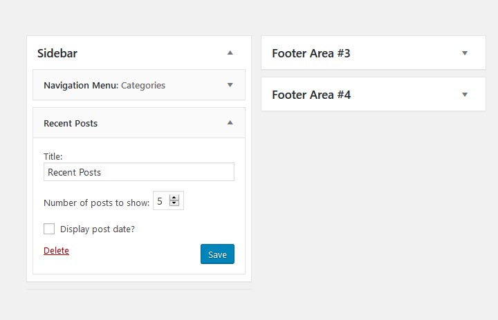
To do so, go to Appearance > Widgets and scroll down to find a widget called “Recent Posts”. Once you’ve found it, click on it and choose to add it to the section of the page you prefer. It might be a good idea to choose the sidebar, as users are already used to looking at the sidebar for more content.
You can then choose the number of posts you wish to display and, depending on your theme, some additional options might be available. Thumbnails with your blog posts’ featured images will appear on your sidebar and from now on, your visitors will be able to easily navigate through your posts.
2. Gallery

Now, we’re not saying that you have included a gallery but if you are willing to, it’s handy to know how to do it. A widget gallery could be useful when your aim is to display certain images on all of the pages of your website. This will also contribute to your overall design.
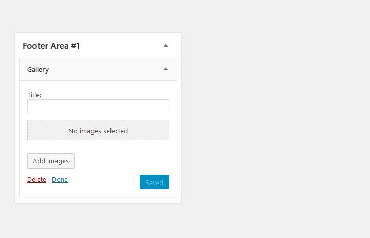
To add a gallery and then customize it, go to Appearance > Widgets. Find the Gallery widget from the list and choose a section to add it to. I usually prefer images to appear in the footer but you might want to try out different looks before choosing a final one. Once added, you’ll be able to upload the images you would like to be displayed on your blog.
3. Calendar

This is another useful gadget you might want to incorporate for your users. Adding a calendar to a blog is far from necessity but can be incredibly helpful when planning a meet and greet, giveaways or contests. Users will appreciate your effort to provide this simplistic aid for ensuring their comfort.
To add a calendar, you’ll need to (once again) go to Appearance > Widgets and select the widget named Calendar. Even though the only customization it allows is the title, you can still get creative by naming your calendar something quirky and original.
4. About me

Let’s not forget why most people have landed on your blog in the first place. It’s you. Your personality as a blogger is an essential part of your identity and content. No matter how much you decide to share with your audience, it’s worth remembering how important you are in this game.
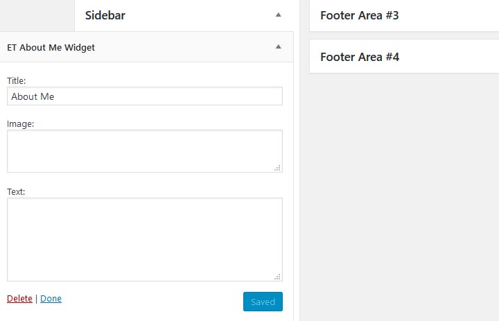
To add the widget, go to Appearance > Widgets > About me. Once again, the choice of the widget placement is yours but I would highly recommend using the sidebar which resonates with the audience’s intuitions of it. By including an image, you’ll let users put a face to the writing and manage to build a connection with you as a person.
5. Search

As simple as they are, search bars can go a long way in providing the desired results, no pun intended. As we’ve already mentioned smooth navigation through a website is an essential aspect of a fine user experience. And nothing can compare to the frustration of a user who can’t find what they’re looking for. This is why, let’s just say, add a search bar!
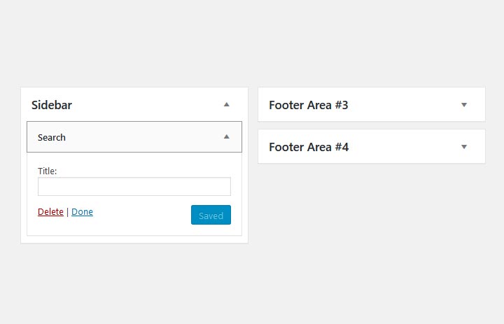
To do so, go to Appearance > Widgets > Search. Search bars are usually available on the top half of a page as users are often looking for a specific theme upon entrance. This is why we recommend placing the widget on the top of the sidebar. As a result, people will be able to spend time on your website and find the required information.
To Conclude
Widgets are some of the most neglected features of WordPress websites. Most people hesitating using them due to their limitations and basic design. Nevertheless, some components are easily accessible through those widgets and can make your life easier. And as a matter of fact, your visitors’ too.
Once you’ve come to look for the best WordPress widgets to add, you can start exploring your options yourself, thus, discovering some unmentioned treasures. Keep in mind that widgets might as well overwhelm your design, so it’s best to keep them at a reasonable amount. Aside from this, they will certainly serve their purpose to your highest expectations.
More blogging tips:
