As much as we can’t believe it, it’s already October. And even though we’re not at the end of the year yet, we can still have a quick review of the biggest web design trends for 2018.
We asked web designers to share their views on the top 5 web design trends for the year and suggest predictions for the upcoming one.
While following these trends does contribute to a more contemporary look, leading experts maintain that a personal twist on these is essential.
We’re sharing the ESSENTIAL web design trends for 2018 and our suggestions on how to incorporate them in your own unique voice.
Do you plan to start a website with a stunning web design? You can do that for $0.00 with our FREE Website Hosting plan!
1. Isometric Illustrations
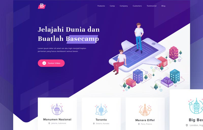 Basecamp Landing Page by Saepul Rohman
With isometric projection being a leading trend in the design industry, we could not help but start with it. The style seems to have taken over the whole internet: from bloggers to digital businesses. Everyone appears to embrace the atmosphere of the futuristic graphic portrayed in isometric illustrations.
The isometric design generally includes any pictorial representation of an object in which all three dimensions are drawn at full scale. In other words, all the lines in isometric drawing parallel to the three major axes are measurable.
Make it Your Own
To turn this trend into your own means to inspire your own voice into the design style. You can achieve it by working closely with a graphic designer who can create illustrations specific to your own brand. This includes both shape and color and the overall feeling of identity you present in the rest of your public communication.
2. Animated Backgrounds
Just like with the web design trends in 2017, animation is a major aspect of most of the trends this year as well. Almost anything in this list can be rendered and interpreted through animation as motion conveys the spirit of the new web.
When it comes to backgrounds, the limit is your imagination. Animation can be found in web design elements of any kind including:
- video backgrounds
- animated graphics
- Javascript particles
The last one in this list is a great twist on traditional animation. Its main benefit, besides looking incredibly cool, is its speed and size which facilitate the smooth loading of your page.
Make it Your Own
As we said, animation comes in all shapes and forms. This versatility allows for the personality of the creator to shine through the web design trends and overcome the templated user experience through originality. To approach animation in an inventive way means to include your own story as a background through a video presentation of your work or through a graphic metaphor of your values.
3. Asymmetry is the New Black
Symmetry has played a grande role in the development of aesthetics being a major criterion for the experience of what we call beautiful. With digital technology taking over the human creative processes, symmetry has turned out to be much more easily achievable than asymmetry.
This human defect of not being able to perfectly duplicate something symmetrically, today turned out to provide what the web user needs. And that is a livelier and more refreshingly dynamic online experience. By breaking the grid, the creator communicates the human agency of this digital representation, and thus, shortens the distance with the viewer.
Make it Your Own
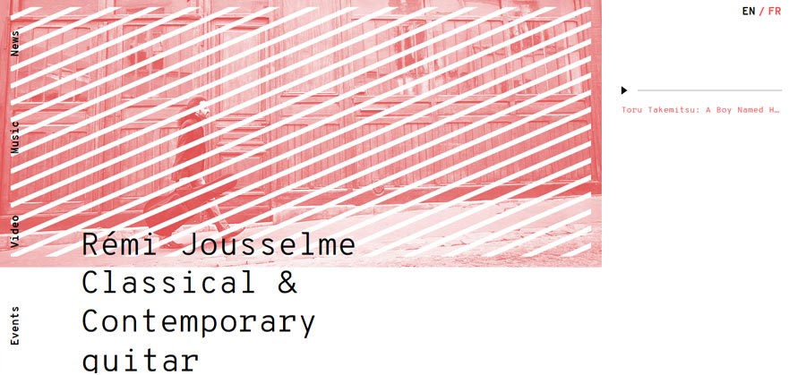
An asymmetry is already a personal approach to web design trends and the followers usually have a unique understanding of it anyway. Representing your own interpretation through your website involves a variety of image cropping techniques, large overlapping pictures and typography, and animated objects making use of the space.
4. Saturated Colors and Gradients
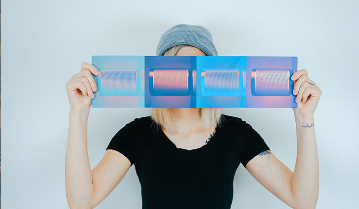
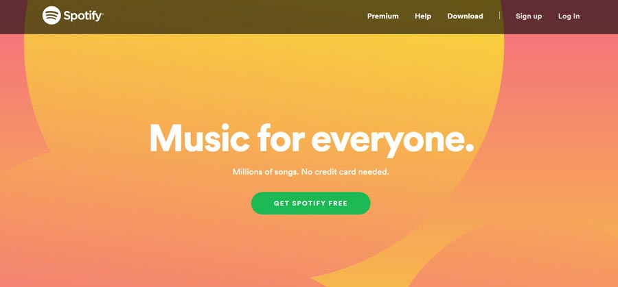
Gradients have been huge for the past couple of years, and it’s not surprising. The previously popular flat and minimal design has been replaced with the more dynamic expressiveness of gradients. And pastel colors have stepped aside to make room for the saturated tones.
The greatest benefit of this trend is how comprehensive and largely applicable it is. Almost any website can make use of the gradient of saturated colors without looking as if they try too hard to fit in. And this is the whole point of following any trend, to be honest!
Make it Your Own
As mentioned, the gradient is such a simple and generic graphics approach that it usually never conveys a lack of personality or annoying conformity to web design trends. On the contrary, applying it can be as discreet as including it in a specific graphic element or as over-the-top as coloring your whole background in a saturated gradient.
5. Bold Animated Typography
This might just seem like a repetition of the animated background trend but, in fact, we were so impressed by it that we decided to dedicate a separate point to it.
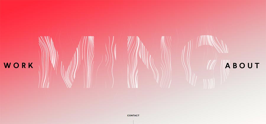
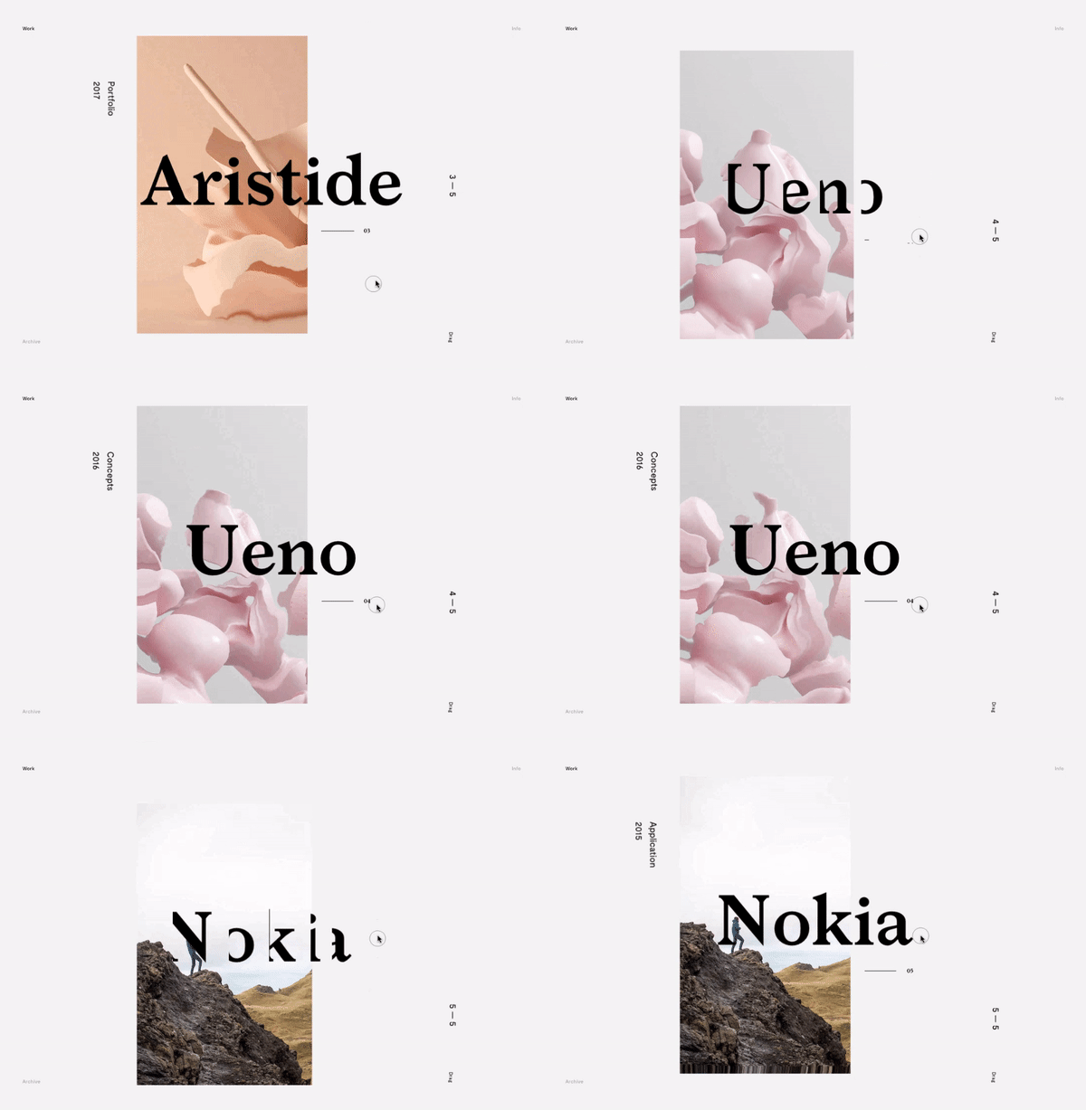
Animated typography is a rising star in the web design galaxy because it allows the incorporation of numerous current trends in an effortless and clean manner. Big and bold fonts have remained a leader in typography for the past few years. Now, however, the approach to it has changed by implementing a motion and fluidity to it.
Make it Your Own
This last trend is the one that can actually be a slippery enterprise if incorporated thoughtlessly. Try finding a font and typography style which suits your business voice and learn how to express its identity of it by a unique motion of the letters.
Final Thoughts
Web design is an ever-evolving process of creation and learning. Experts around the globe contribute to the collective dialogue through their work. This is why trends seem to come and go with the time, leaving us questioning their authenticity and perceivable quality.
But this is the nature of web design trends. While they are supposed to convey the spirit of the time they appear, they shall not be expected to remain unchanged throughout the years. This is what makes the web the incredible place it is – its constantly developing appearance catering to the users’ needs and expectations. And as a web creator, you play the leading role in that.
