404 pages are the crossroad where you can either lose your prospective or convert them into paying customers. One of the most underrated pages on your website can be a turning point for your business.
So what does it take to win your users back through a single error page? And most importantly, what exactly is a 404 page?
What is a 404 page?
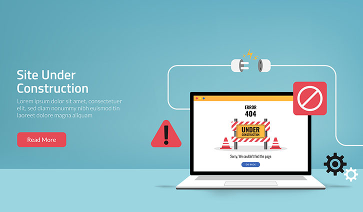
Essentially, 404 page is the error page that displays to your users when they go to a page that doesn’t exist within your active website.
First and foremost, you need to know that as a result of a broken link, 404 pages are bound to lower your UX. Fixing your broken links is an important task unless you want to lose search engines’ trust. That’s the best advice to get here.
No matter how hard you try, however, the possibility of stumbling upon an unexistent webpage remains. That’s why once your users have experienced the unpleasant error, it’s crucial to turn the situation in your favor. The best method is incorporating creative 404 pages into your website keeping people so entertained that they can’t get mad at you.
We’ve collected the top 6 creative 404 pages out there which illustrate that when something goes wrong, you need to go right.
1. Design Meets Technology

Hot Dot Production‘s 404 page lives up to its promise of meeting technology and design. With a sharp contemporary-looking graphic representation of the numbers, the page is made up of hundreds of tiny dots which move in response to your mouse movements and clicks. They surely know how to entertain their users.
2. Sophisticated Humour

Not everyone is supposed to understand a joke. What really matters is that the message gets to the right people. Bret Victor knows that and that’s why his 404 page refers to the iconic Magritte painting.
Simplicity is also highly appreciated when going for a sophisticated reference. No animation, no interaction, and yet users are left with a smirk on their faces.
3. Not So Sophisticated Humour

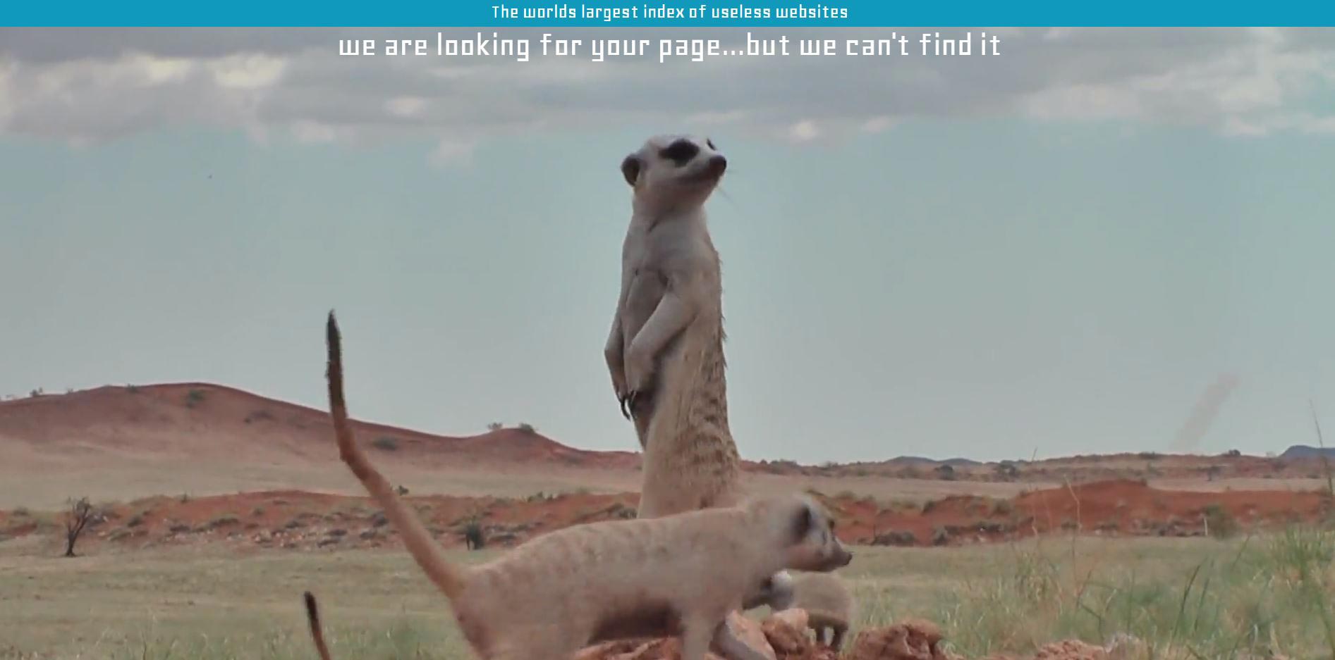
You don’t always need to be profound to make people smile. Sometimes a cute video of meerkats can do it. The Useless Web Index took advantage of its position as an entertainer and created an amusing 404 page that can’t leave you indifferent. Silly animals are always a winning strategy and when it comes to your creative 404 page we guarantee its success.
4. Move It

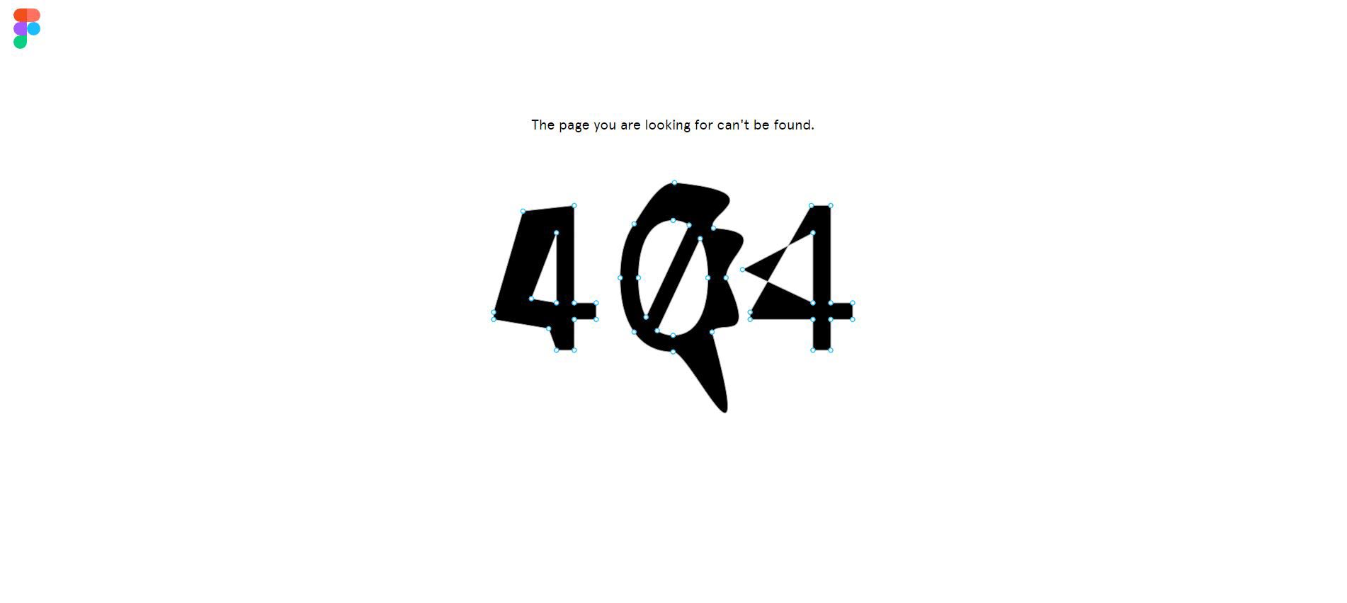
There are few pages on the web that are able to entertain visitors as much as the interactive ones. Figma’s solution completely resonates with the philosophy of interactive web where the leading role is the user’s. Their 404 page consists of the numbers with anchor points you can move and stretch to your preference. While it might sound useless at first, it’s actually really fascinating once experienced first-hand.
5. Players’ Paradise

What would you expect from a gaming website’s 404 page? I bet, I won’t surprise you when I tell you that Platinum Games decided to incorporate a mini-game with a mini-Bayonetta to entertain their gamer audience. The best thing is that it runs on mobile as well. Wherever you are, once you stumble upon an error on their page, you know you won’t be disappointed.
6. Give Dimensions

Playing with texture, patterns and dimension have long been proven to work great on the web. The factor of the unexpected is also a leading one when it comes to dimensions on your creative 404 pages. CSS Tricks remained true to their content by creating a humorous error page titled “You’ve ripped a hole in the fabric of the internet”.
